We had our last regular meeting of the HOTPPG two weeks ago. As always we had our image competitions. The challenge for this month was Low Light images. It was a black and white print competition. While we were on our cruise in August, I took photographs during the entertainment in the evening. In looking at them, there was one that struck me as a good candidate for conversion to black and white. So, I used Nik Silver Effects Pro and converted it to black and white, and then cropped it square. It ended up coming in second, but that was enough to guaranty that I would win the Black and White Artist competition for the year.
Category Archives: How it was done
Rowing on the River
The Waco Wild West 100 Bike ride was last weekend. As always I was heavily involved with the rest stops, But I also took a lot of pictures at the Start/Finish line. As with last year’s I was setting things up, I noticed there was a rowing competition on the river and I took some pictures of them from the Washington Avenue Bridge.
There was some rather strong manipulation involved in this image. I took it into Nik Color Effects Pro 4 and added the Indian Summer effect. That increased the yellows in the foliage on the bank of the river. I also added a subtle texture to the image, but it still was missing something. So, I decided to add it the image of the Great Blue Heron flying over the top of them.
Repetitive Patterns Competition
The April Challenge Competition for the Heat of Texas Professional Photographers Guild was “Repetitive Patterns.” Our train for New Orleans was late getting into Houston. The last time we went, I noticed the platform and how the supports lined up. I am not sure how many different pictures I took of them, but it was a lot. I finally decided one of them was worth more time. This began as an HDR image. After processing, the colors were rather bright, as much of the support was painted AMTRAK blue. So, once I had the composition I wanted, I decided to convert it to Black and White. This image took first place in the competition.
Chisholm Dreams
The Heart of Texas Professional Photographers Guild holds monthly image competitions. The members submit any image they choose in either the Professional or Associate Category. There is also a monthly “Challenge” competition where members create an image with a specified theme or technique. In February, the theme was a “Domestic Animal.” I decided to try an do something with cattle in a field.
I took an afternoon and drove out Highway 6. My plan was to photograph some cattle and try and get something interesting. I came upon a field in which a rather substantial steer was standing on the rim of a tank. I started taking pictures of it. As things progressed I started thinking more and more about the idea of isolating that one steer in the frame. I decided converting it to Black and White would add a little more emphasis to it, but that left a rather large area of sky to the left. I decided I could reduce that by cropping the scene into more of a panorama. That helped somewhat, but that sky was still too distracting. So, as I considered it, I began to think about cattle and the old Chisholm Trail and the Waco suspension bridge. That made me decide to add an image of the cowboy statue at the suspension bridge. So, the final image is
Rainy Day
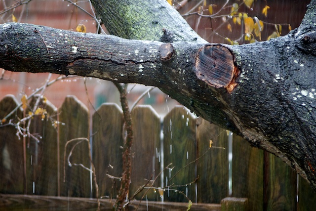
It rained pretty much all morning, and at times the rain got rather heavy. I looked out the back and saw water running off the oak tree and thought there might be a possible picture in it.
For this picture, I cropped the original, adjusted exposure and black levels, added contrast, sharpened it and added a vignette. Those are pretty much standard adjustments I make for any image. This fairly accurately represents the scene. Water can be seen dripping from the limb.
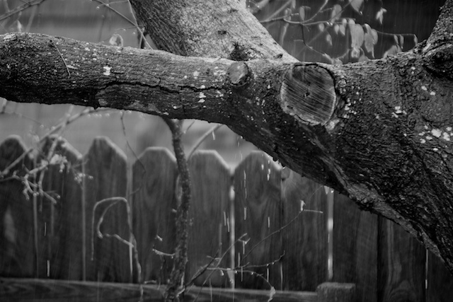
I took that image and converted it to black and white. This helped remove distracting areas of color, but almost seemed too sterile.
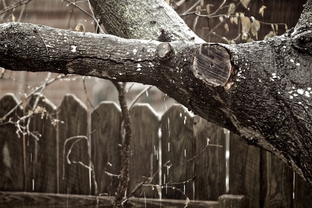
I went back to the original image and started by removing color saturation. That helped remove distracting areas of color. To give it a little more interest, I added a very light sepia tone to it.
Fine Art Prints
I have been intrigued by the idea of fine art prints. A CreativeLive seminar with Doug Landreth explored how he goes about making them. It was interesting, but there was not nearly enough explanation. In Photoshop, he overlays images with layers that he manipulates into patterns that add barely visible elements and textures to the image. The result is quite good.
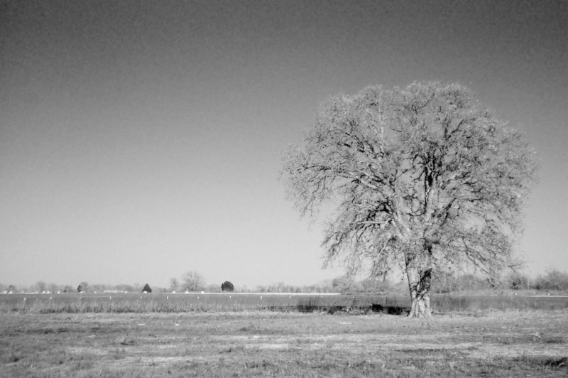
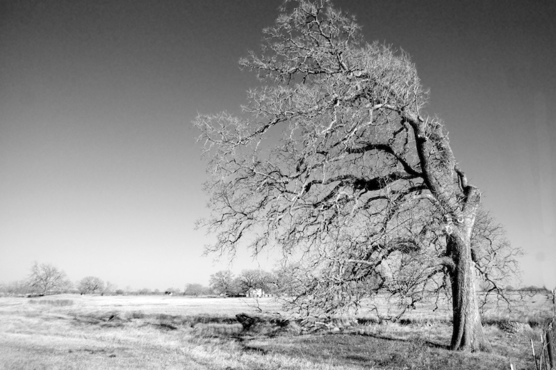
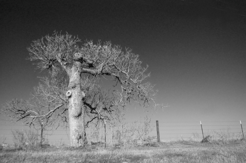
As a first step in looking at that, I took some of the pictures I took last week on Highway 6, and transformed them into Black and White.
It turns out there are a variety of ways of producing Black and White images. One is simply to reduce the color saturation of the image. There are other “effects” in Aperture. They somehow use selective filters in the operation. For these, the one that I liked the most used a Red filter. I am not sure what that really means, but it had the effect of darkening areas of the sky until they were almost black.
It is almost like using a polarizing filter. The rest seemed to exaggerate the starkness of the image.
Looking at these calls to mind scenes from the old John Ford Westerns.
Dandelion
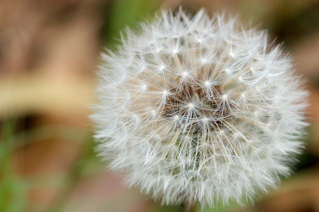
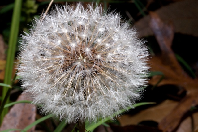
A few days ago, there was a dandelion in the front yard. I wanted to get a picture of it, but I saw it early in the morning, and by the time I got home from work, all the seeds had blown away. This morning, I was pulling leaves out of the pool, and I saw this dandelion along side the pool. I don’t use my Konica/Minolta 7D much any more, but I kind of do use it for macro photography. So, I put the Tamron 90mm macro on it and set up the tripod.
The first shots were pretty good, but I wanted more. So, I got the small LED light and used it to produce a little more light.
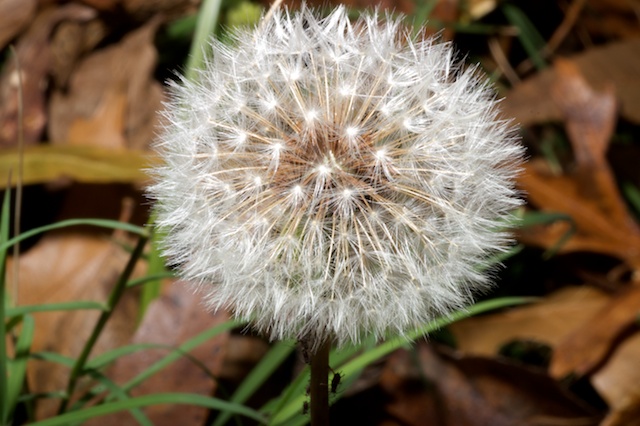
That produced a nice effect, reflecting off the filaments of the seeds. I then got my flash, and used it kind of hand held with radio triggers.
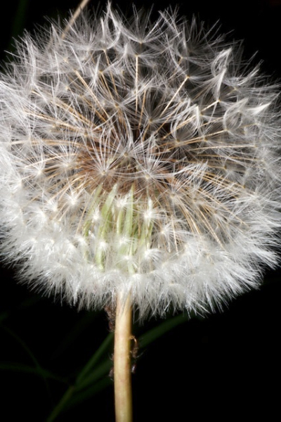
There was more depth of field because I had to stop the lens way down to get the correct exposure, but, again, the effect was pleasing. By holding the flash low, I put much less light on the surroundings, and got a really interesting effect.
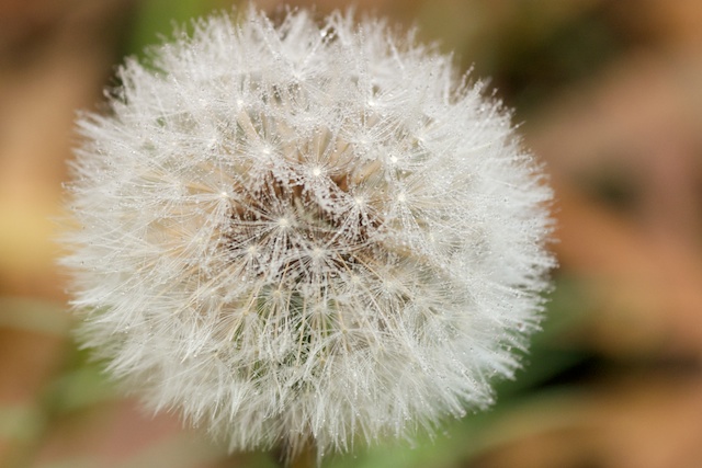
Now, the background was essentially unexposed. But now you can see something else that I didn’t even notice. There were small bugs crawling on the stem. Finally, I wanted to add a little more. So, using a spray bottle, I created a little “Dew.”
PhotoJunction
I haven’t posted in a few days. Cindy is finishing the edits for the wedding I shot with her three weeks ago. Once she is done, I can post my images here.
We have been discussing an album for the couple. I have used Aperture for other books. The problem was there is no way of exporting the compiled pages except as pdf files. So, you are limited to using Apple’s vendors to produce the book. Their prices are reasonable, but there is not a whole lot of selection. Now, I see Apple has allowed a few high end vendors to produce plug ins that allow for the ordering of really high end books.
In spite of that, it appears there is much better flexibility by producing a book outside of Aperture. I have been trying to learn a program called PhotoJunction that interacts with a variety of vendors to allow for the design and production of books. So, I have spent some time the last couple of days trying to learn this program. For the most part, it is intuitive and utilizes lots of drag and drop procedures.
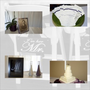
Additionally, I am looking at a web site called albumexposure that allows users to upload compiled albums and then allows the customer to look at them and proof them. After all changes have been made, then the album can be ordered from a variety of vendors directly from this web site.
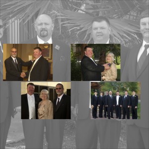
I have found out that there are essentially two different categories of such albums. The “press” books are produced by using one image per page. (The images can be multiple pictures like the one above.) These are then printed on book/magazine quality paper. The resulting book is like a standard coffee table book. The process is relatively cheap, and the price of the books that are produced depends on covers and linings, but is relatively inexpensive.
The “matted” books print the images on photographic paper. Although the templates allow for multiple images on the same page, apparently the production process will not allow for any overlap of the images. So, in my page above, the four pictures would be printed on the page, but not the background image. The resulting photographic print is then adhered to a mat, making the pages very much thicker. This is kind of like an old style scrapbook, but one of extremely high quality. In looking at various vendors for these, it would be easy to spend $500 on a book. In one case, the cost of the book was $6500!