Driving down Franklin, I have frequently noticed the large yellow doors on a building downtown. The building is red brick, and the yellow doors provide quite a colorful contrast.

The doors themselves have a great deal of character.


Driving down Franklin, I have frequently noticed the large yellow doors on a building downtown. The building is red brick, and the yellow doors provide quite a colorful contrast.

The doors themselves have a great deal of character.

I took a little time off to try and get a good picture of the VA Hospital. It is always such a colorful and patriotic location with flags lining the driveway.

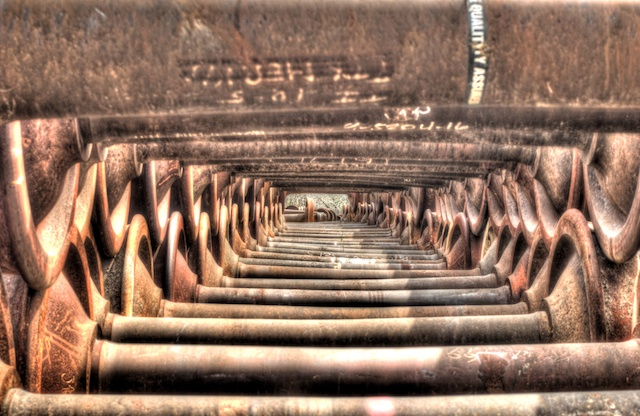
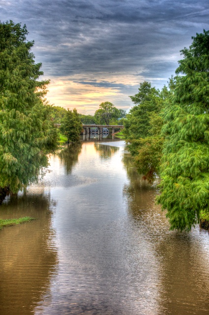
I took an afternoon and went to Cameron Park. Jacob’s Ladder is a long stair that goes from the upper park area to the riverfront.

Cameron Park Clubhouse is a pavilion that can be rented for various functions.

We took a small road trip a couple weeks ago to Nacogdoches. On the way home, we drove Hwy 84 most of the way. I stopped several places for some pictures, and ended up with some nice images.

I liked the contrast between the color of the shed and ramp and the surrounding winter vegetation here.

The way the overgrown vegetation was melding with this house was quite interesting. And, the two vultures on the roof were rather symbolic.
While in Seattle, we visited the museum dedicated to the glass sculptures of Chihuly. It is located right next to the space needle.  The sculpts are in various rooms in the museum, but they are also in various garden settings.

While in Seattle, we went to Pike Place Market. This was an amazing place.

All kinds of seafood and other stuff.

I had the pleasure of spending a week in Seattle recently and was able to take lots of pictures.

This one shows their ferris wheel and the football and baseball stadiums.

This one is looking towards downtown from the top of the space needle.

This is the ferry across Puget Sound.
Another image of mine received a second place in the Associate’s category of the Heart of Texas Professional Photographers Guild image competition on February 11. This is the original version.

However, in order to improve it for competition, I removed some of the distracting elements. The speaker, Mark McCall did a critique of all the images and suggested a couple of small additional changes. He also said that images should always have a border. So, that said, this is the final version of the image.

I entered this image into the January Heart of Texas Professional Photographers’ Guild image contest. I took second place in the Associate Member category.
Additionally, I received notification from ViewBug. They have a system of tallying the comments and responses and then produce a year-end summary. They said I scored in the top 20% of all users on their site.